Create a Publication-Ready Rietveld Plot
In this exercise a plot will be created in a form intended for publication from a “finished” refinement in GSAS-II.
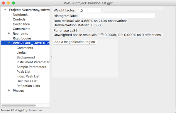
Step 1: Read in the project file
1. Use the File/Open
Project menu item to GSAS-II project file PubPlotTest.gpx.
(If you used the Help/Download
tutorial menu entry to open this page with the recommended downloading of
the exercise files, then you should see this file in the file browser. If not,
you can manually download it from https://advancedphotonsource.github.io/GSAS-II-tutorials/RietPlot/data/;
in this case you will need to navigate to the download location manually.)
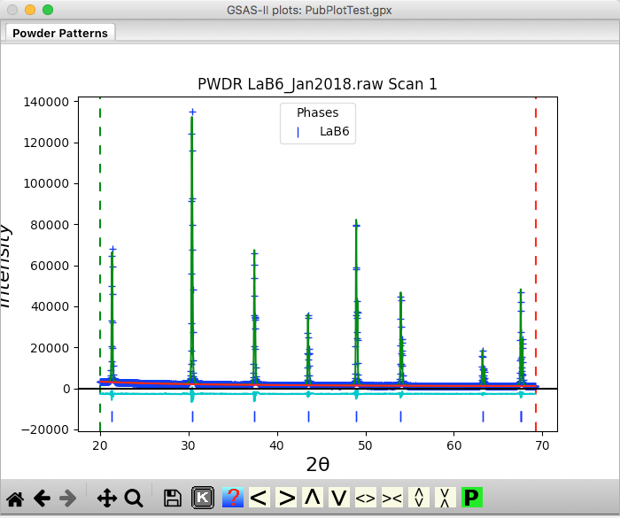
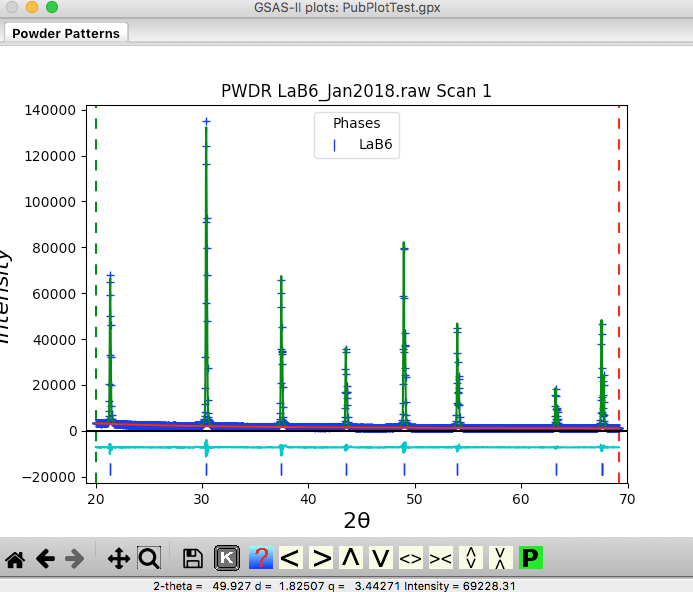
At this point the GSAS-II data tree window will have several entries. If the PWDR entry is not selected (as below), click on it.
and the plot window will show the powder pattern along with the fit:
Step 2: Format Plot
![]() The
plot above can be improved a bit, for example by moving the difference curve
down so it can be seen more clearly. First click on the “Shrink Y” yellow tool bar button (shown to
right) to make some room at the bottom of the plot.
The
plot above can be improved a bit, for example by moving the difference curve
down so it can be seen more clearly. First click on the “Shrink Y” yellow tool bar button (shown to
right) to make some room at the bottom of the plot.
![]() Make
sure that the zoom or pan buttons are not selected. Then click with the left
mouse button on the cyan different curve and while holding the button down,
drag the difference curve down a little bit. This will now be too close to the
blue reflection tick marks, so they can be dragged down as well, by clicking on
them, moving the mouse with the button down and releasing the button when the
tick marks are in the chosen spot. Note that if the drag operation does not
work, then zoom or pan mode is very likely selected, or the PWDR item has not
been selected from the tree.
Make
sure that the zoom or pan buttons are not selected. Then click with the left
mouse button on the cyan different curve and while holding the button down,
drag the difference curve down a little bit. This will now be too close to the
blue reflection tick marks, so they can be dragged down as well, by clicking on
them, moving the mouse with the button down and releasing the button when the
tick marks are in the chosen spot. Note that if the drag operation does not
work, then zoom or pan mode is very likely selected, or the PWDR item has not
been selected from the tree.
We can make the plot a bit more compact, by either using “Zoom” to draw a box around the region to be displayed or by pressing the “Home” button. I used zoom to get this:
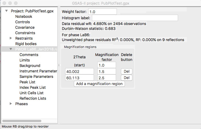
Step 3: Magnification Regions
 While
not particularly important for the plot above, many datasets are dominated by a
few intense peaks and it can be of significant value
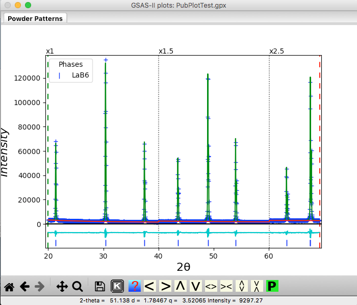
to increase the scale in other regions. To add magnification via the mouse,
first turn off the zoom mode, if on. Move the mouse to around 60 degrees
(vertically, anywhere inside the axes) and press “a” to add a magnification
region. A line appears on the plot and a magnification region is added to the
data window, as shown to right. Another way to add magnification is with the
“Add a magnification region” button. Press that to add a second region. This
adds a region starting somewhere around the middle of the pattern. Change the
location of this to around 40 degrees, if needed and the magnification factors
to 1.5 and 2.5 respectively. The window and plot will look as below.
While
not particularly important for the plot above, many datasets are dominated by a
few intense peaks and it can be of significant value
to increase the scale in other regions. To add magnification via the mouse,
first turn off the zoom mode, if on. Move the mouse to around 60 degrees
(vertically, anywhere inside the axes) and press “a” to add a magnification
region. A line appears on the plot and a magnification region is added to the
data window, as shown to right. Another way to add magnification is with the
“Add a magnification region” button. Press that to add a second region. This
adds a region starting somewhere around the middle of the pattern. Change the
location of this to around 40 degrees, if needed and the magnification factors
to 1.5 and 2.5 respectively. The window and plot will look as below.
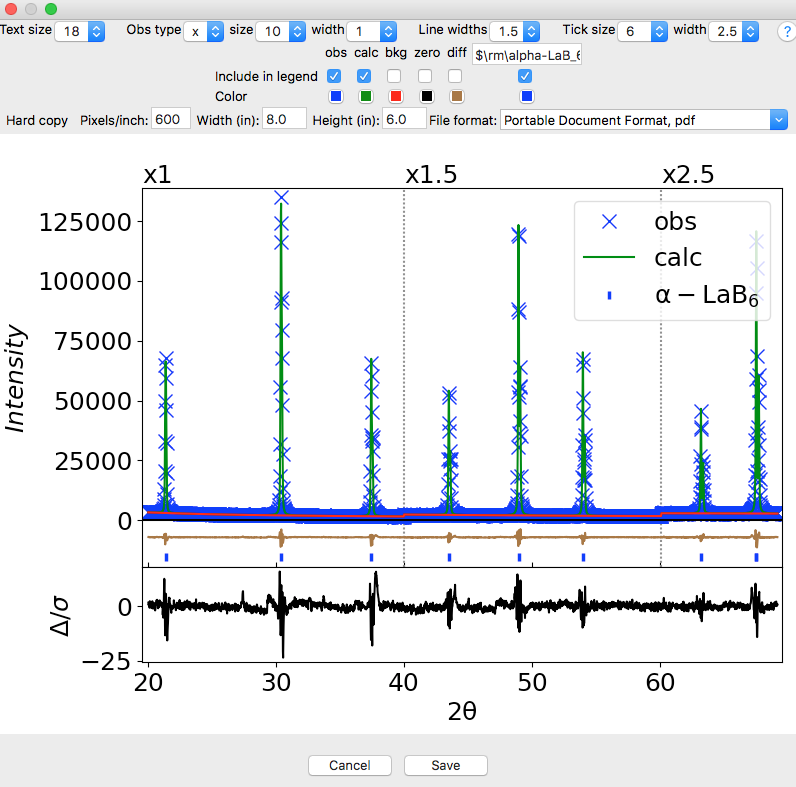
Step 4: Customize the Publication Plot
![]() Press
the “P” button to the right of the toolbar. This opens a window where aspects
of the plot can be customized, as below. Note that as changes are made in the
controls at the top of the window, these changes are displayed immediately.
Also note the addition of an additional difference plot at the bottom. This
shows the weighted difference between the observed and calculated diffraction
pattern ([obs-cal]/sigma); the square of this is what
is actually minimized.
Press
the “P” button to the right of the toolbar. This opens a window where aspects
of the plot can be customized, as below. Note that as changes are made in the
controls at the top of the window, these changes are displayed immediately.
Also note the addition of an additional difference plot at the bottom. This
shows the weighted difference between the observed and calculated diffraction
pattern ([obs-cal]/sigma); the square of this is what
is actually minimized.
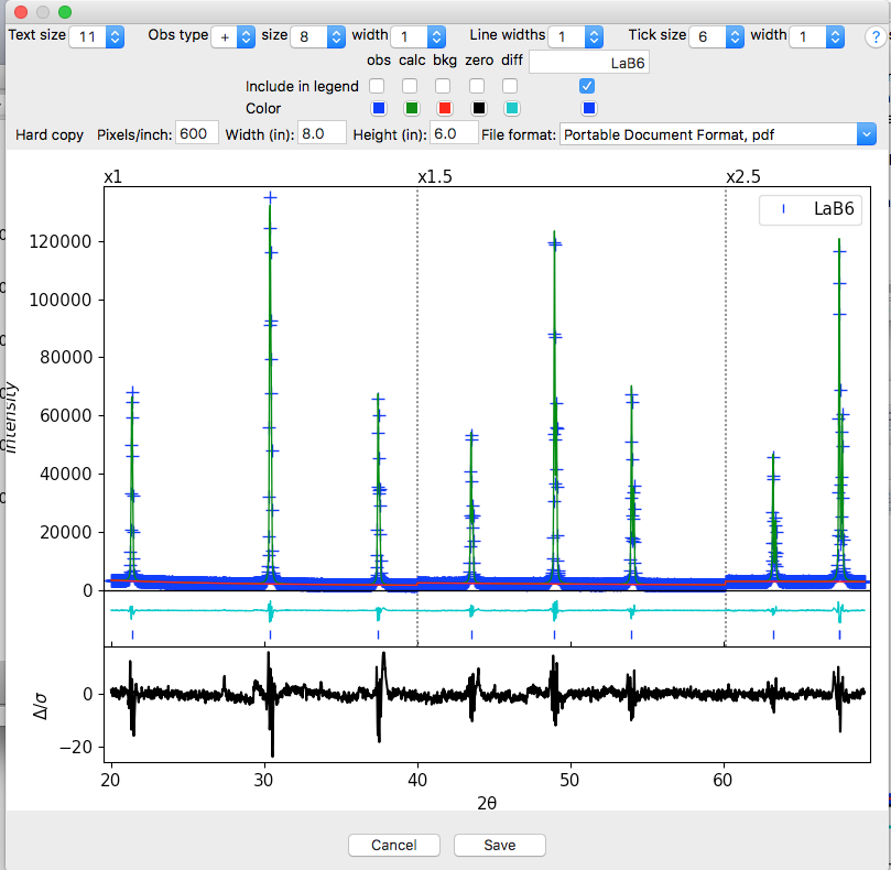
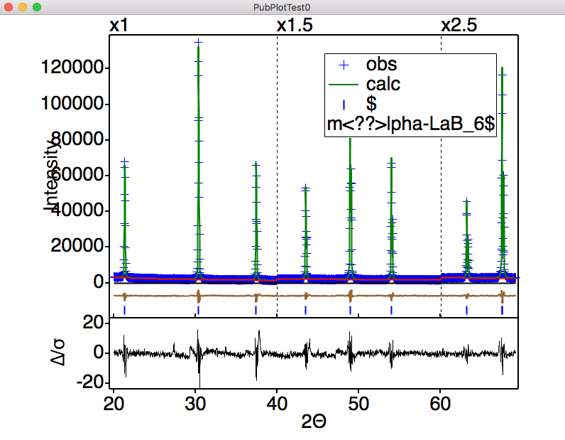
As examples of the types of changes that can be made here:
· Most journals will want larger lettering for labels so change the text size to 18
· We can use LaTeX symbols in the phase caption, so let’s change that to $\rm\alpha-LaB_6$
· Click on “Include in legend” for obs and calc to include them in the legend
· Click on the cyan square for the diff color and choose something more to your liking (brown here)
· Make the symbols and lines a bit more visible (when the plot is shrunk) by changing the symbols to an “x”, the size to 10, the line widths to 1.5 and the tick width to 2.5.
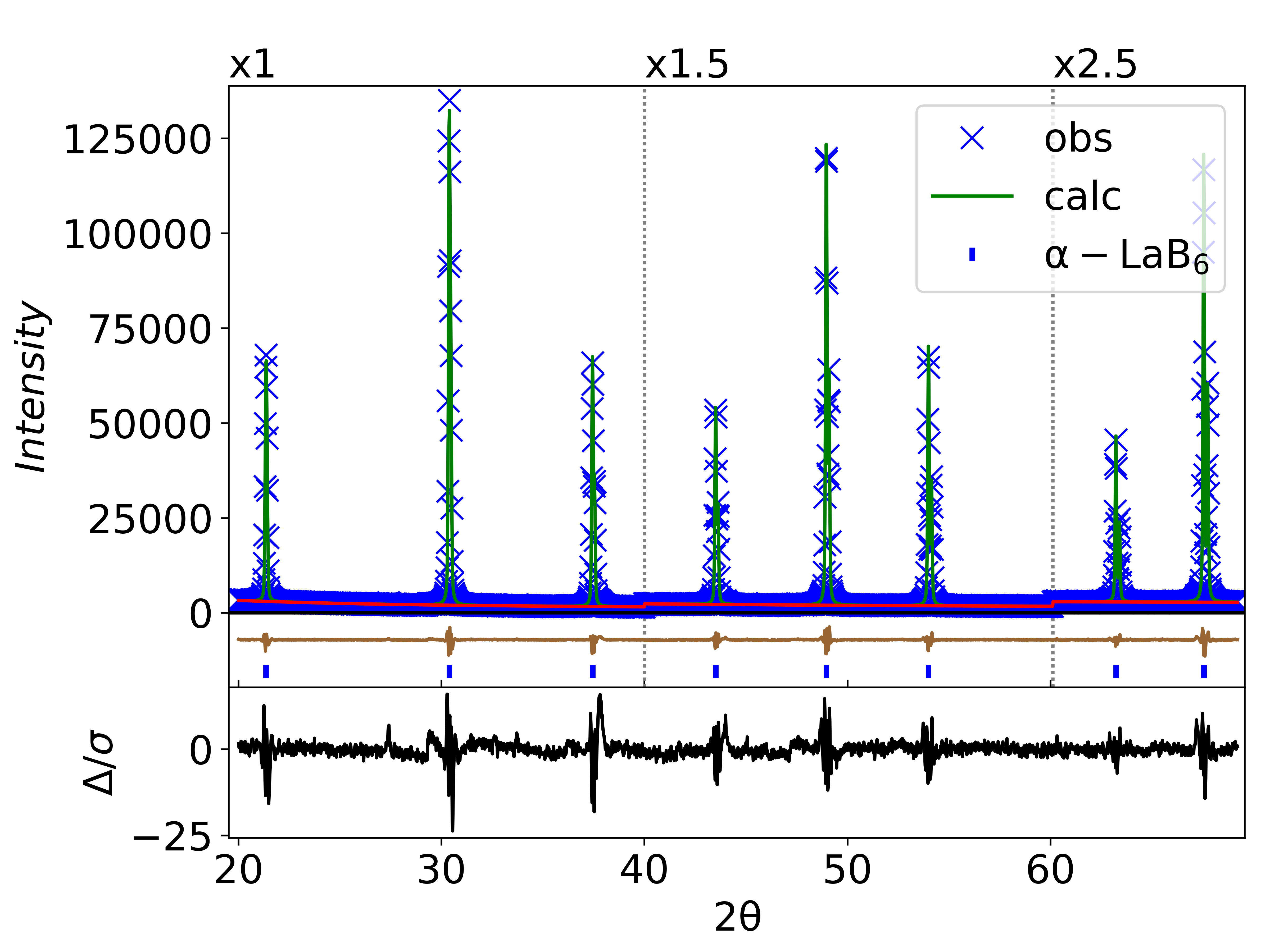
The plot now appears as below:
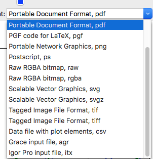 The
export format can be selected using the pull-down menu for file format (shown
to right). When the save button (at bottom) is used a file will be written in
this format. The plot can be exported as a bitmap file by selecting an export
format of png or tif, but
better is to use pdf or svg, as these are vector
formats and there will be no degradation of plot due to pixilation. This is to
be preferred where possible.
The
export format can be selected using the pull-down menu for file format (shown
to right). When the save button (at bottom) is used a file will be written in
this format. The plot can be exported as a bitmap file by selecting an export
format of png or tif, but
better is to use pdf or svg, as these are vector
formats and there will be no degradation of plot due to pixilation. This is to
be preferred where possible.
Sample .pdf (PubPlotTest.pdf) and .png (PubPlotTest.png) files can be found in this directory: https://advancedphotonsource.github.io/GSAS-II-tutorials/RietPlot/examples/
The remaining formats allow the plot to be exported to other plotting programs where further customization is possible. The Grace, Igor Pro and Origin programs both allow input of values and plotting instructions and are supported as export formats (see below). For other programs the data in the plot can be read from the .csv version of the file, but the user must construct the plot themself.
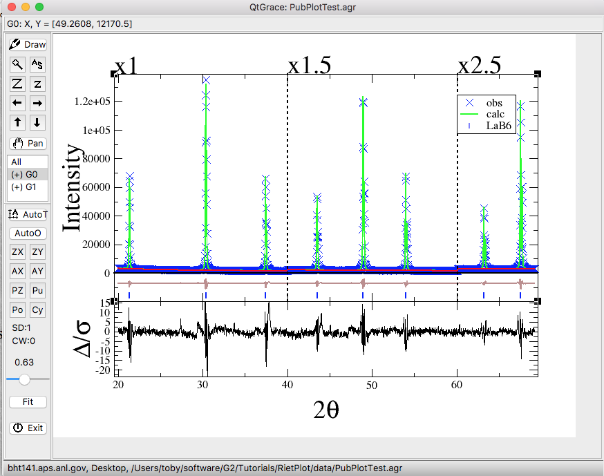
Step 5A: Export to Grace
The Grace program (originally called XMGR) is a free open-source WYSIWYG plotting tool. While Grace has not been updated in about a decade and is not easy to run on all platforms, the excellent QtGrace port runs on Windows, Mac and Linux and is easy to download and install from here: https://sourceforge.net/projects/qtgrace/files/. There is also a GTK port of Grace that is likely of greatest interest to Linux users: GraceGTK (not tested).
To export to Grace select the “Grace input file, agr” for File format and press Save. Below shows the screen in QtGrace after reading the .agr file produced here. This can be annotated and extensively modified within Grace.
Step 5B: Export to Igor Pro
Igor Pro is commercial software (and not cheap) but it is widely used in some circles and also does a great job for creating high-quality graphics. Igor Pro offers inset plots and many other features for creating figures for publication. Note a free 30-day demo version of Igor Pro is available.
To export to Igor Pro select the “Igor Pro input file, itx” for File format and press Save. Below is the Igor window after reading the .itx file. Note that it is easy to move the Intensity label and change the text in the legend, etc.
Step 5C: Export to Origin
Origin and OriginPro are commercial software packages from OriginLab that are widely used for graphing of scientific data. OriginLab has recently released a Python library, enabling the direct export of plots from GSAS-II. Note that the 2021 or newer version of OriginPro is required. Origin runs only on Windows, so this option is not shown on other platforms. The export feature for OriginPro was developed by Conrad Gillard. He provides a short video demonstrating its use.
To export to Origin, select "OriginPro connection" for file format and click the Save button.
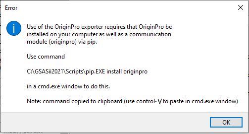
Normally the OriginLab-supplied Python module will not be installed in the GSAS-II Python distribution and will need to be installed using the Python pip command. Thus, the first time this feature is used, the error message below will be displayed to indicate that the module was not found. Follow the instructions in this message, noting that the command window can be accessed by typing "cmd" in the search box and that the command can be pasted into that window using the Control-V
Once the module is installed, repeating the previous step
where "OriginPro connection" is selected
for the file format and the Save button is clicked will cause GSAS-II to pass
the plot information to the OriginLab “originpro” module which will open Origin and generate a
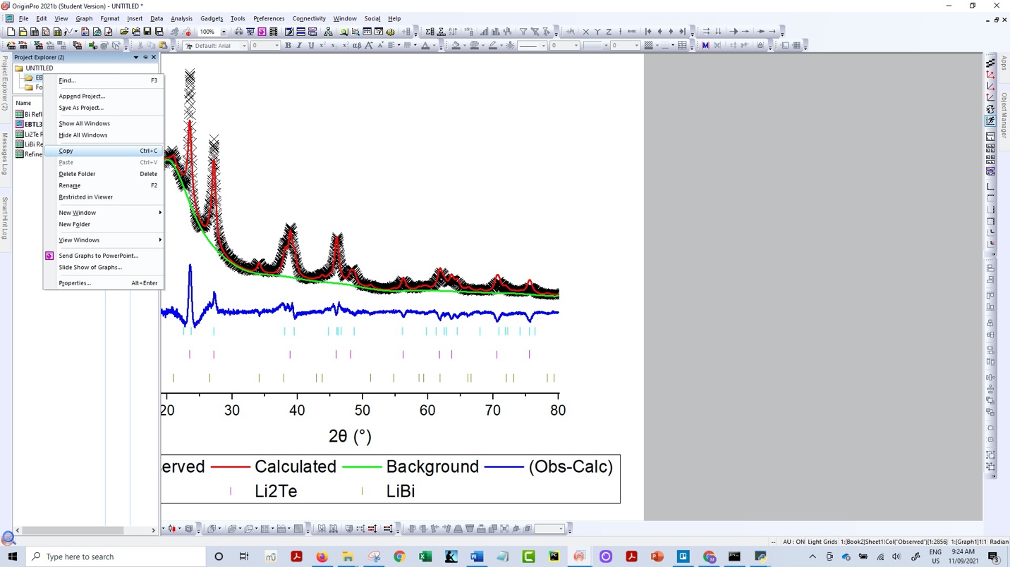
plot of the figure, as shown in the following image. 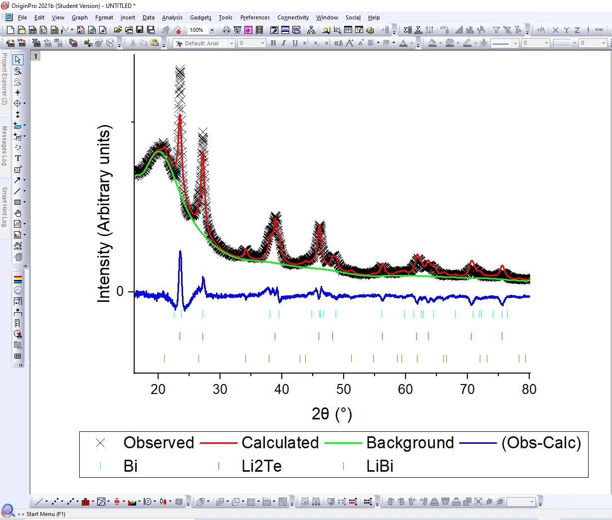
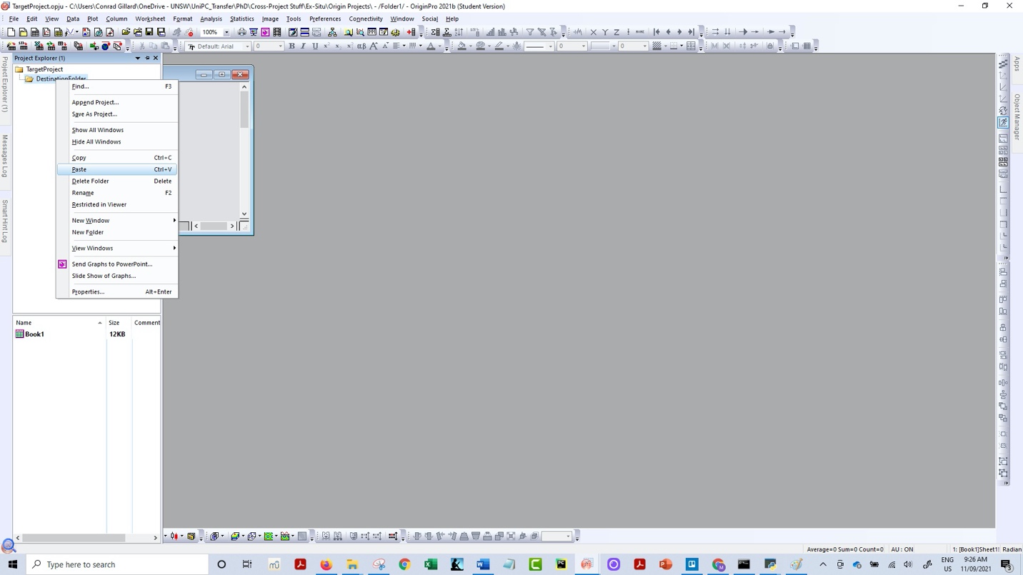
Note that this figure can then be modified via the standard capabilities in the Origin graphical user interface. Finally, users may optionally incorporate this plot into an existing Origin project. This is accomplished by first right clicking the folder containing the plot and selecting "Copy". Next, users open their target Origin project, right click on the desired destination folder, and click "Paste", see below.